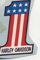
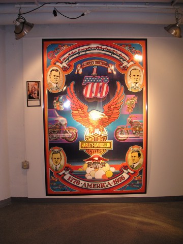
Developed in 1974 for AMF/Harley-Davidson, the Eagle graphics were initially commissioned as tank decals for the 1976 V-Twin motorcycles honoring the 200th Bicentennial Anniversary of the United States of America. The creative direction from AMF Harley-Davidson Styling was to develop a graphic incorporating the number “76”, “stars and stripes” and “red, white and blue” elements. These were established “hot” graphic elements in the motorcycle culture made popular by the likes of motorcycle daredevil Evel Knievel, Peter Fonda with his Captain America chopper from the film Easy rider and the AMF Harley-Davidson #1 racing logo developed around 1970.
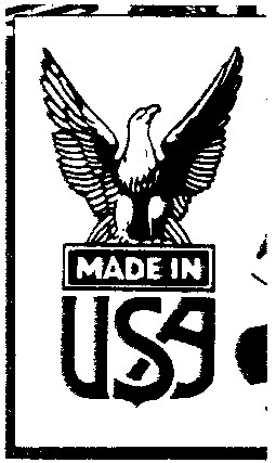
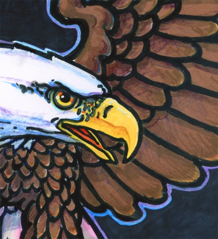
But the creative direction was to change. Smith began gathering reference materials on the 200th Bicentennial. “I was immediately impressed with the early American eagles, the governmental eagles landing on a shield of stars and stripes”, recalls Smith. “And the early American eagles from my Letra set clip art, especially a small clip art eagle perched on the statement “Made in the USA.”
Smith borrowed a small book published by AMF entitled “The Story of Harley-Davidson” written by a friend and freelance copywriter Joel Habush working just down the hall from Smith’s studio in the historic Iron Block Building. “I was really impressed with the story, the history of the Harley-Davidson’s company and I thought it was historically significant that they were the only motorcycle manufacturer left in the United States.”
Smith began taking notes and sketching layouts incorporating Harley-Davidson’s history; the company’s humble beginnings with the four founding fathers, the company’s involvement with WWI and WWII. He sketched war bikes, police bikes, racers like the ½ mile tracker, hill climbers, daredevil jumper Evel Knievel, road racers, drag racers, dirt trackers and the world’s speed record. “I loved designing and illustrating posters.”, recalls Smith. “The original commission was for the design and development of tank decals for the Bicentennial Liberty Edition motorcycles only. But I had a great idea for a poster. This wasn’t gonna be about the history of the United States, this was gonna be about the history of the Harley Davidson Motor Company.”
Smith sketched his first eagle concept combining and reworking elements from existing clip art and the statement “Made in the USA”. He positioned the old Harley-Davidson shield using an image from the 1930’s with the wings. “I had a patch of that old Harley shield with wings,” states Smith. “I had one on my tanker jacket and my beret. I liked the older stuff from the 30’s and 40’s, I wasn’t a radical chopper guy.” Smith added stars and stripes, red, white and blue banners, the American flag, the current advertising theme “The Great American Freedom Machine”, the #1 racing logo and a dynamic scene of bikers coming down the wide open highway with the “76” graphic floating in the majestic cloud-filled, spacious skies. As Smith recalls, “I wanted to celebrate Harley’s unique American history, too. I wanted to take something Americana and something Harley and combine them.” And he realized the layout he was developing was also ideal for a painting commission.
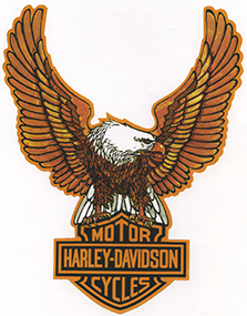
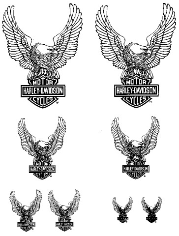
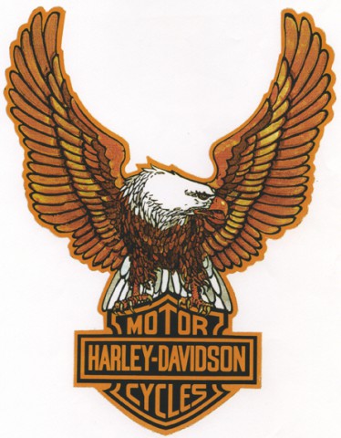
Smith continued to work on the “76” theme originally presented from Harley-Davidson Styling Department attempting to unite the graphic with his emerging eagle. But the marriage of these two images was not a fit. Yet, what seemed to be a natural fit and one that satisfied the new creative directive of combining ‘something Americana with something Harley” happened when Smith workout the idea of replacing the Americana stars and stripes shield from the early American eagle graphic with the old Harley-Davidson trademark, the bar-and-shield. The finished conceptual is know today as the Harley-Davidson Eagle on the Bar-and-Shield. The idea was a departure from the original design directive from HD Styling but after much convincing from Smith, Bill Davidson decided to try the image with Harley’s racing team.
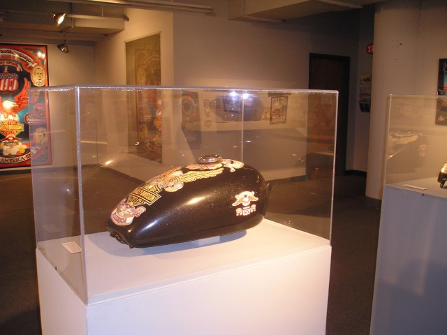
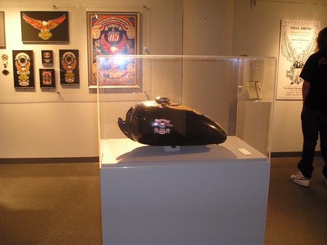
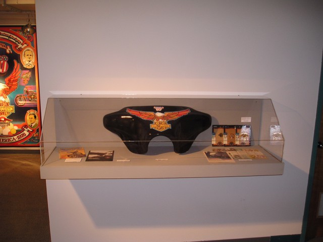
Smith continued with the Eagle and the bar-and-shield concept and proceeded to layout the top tank decals fro the FX and XL Sportster. The side tank decals expanded on the Made in the USA Eagle concept from his original poster layout. The FLH fairing featured the new Harley eagle with outstretched wings perched on the bar and shield logo. “The 76 concept was still there,” confirms Smith. “But it no longer was the main theme, the main centerpiece dominating the tank graphics.” It was to take a position above the Eagle as a separate decal positioned around the gas cap along with the #1 logo. It was never to be incorporated or utilized by Harley Davidson beyond its original use on the 1976 Bicentennial Liberty Edition project.
It was while working on the painting the Smith dubbed the motorcycle the “Liberty Edition” ending all reference to the “Spirit of 76” as referenced on the right to work order from the factory. Advertised by the Motor Company as a “future collector’s item” and “optionally available…for a limited time,” the 1976 Bicentennial Liberty Edition motorcycle was the first special-edition Harley-Davidson motorcycle and the first Harley motorcycle tanks to bear the old Harley-Davidson bar-and-shield trademark as a graphic element.
The Eagle graphics were an immediate hit with the American motorcyclist. The Eagle on the Bar-and-Shield has been reproduced on just about everything ranging from Harley-Davidson’s corporate identity, on countless products and tattooed on may a biker’s arms and chests.
“I wanted to make a graphic statement that was not only contemporary, but all-American,” states Smith. “And, one that maintained the longevity and the traditional of the Harley-Davidson Motor Company.”
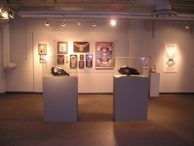
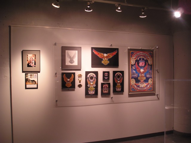
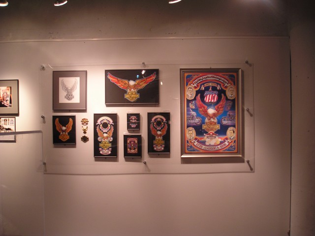
The following exhibition presents the step by step design process involved in the development of this amazing, legendary motorcycle graphics that has come to not only represent the Harley-Davidson Motor Company worldwide but has grown to be an American graphic icon recognized throughout the world as a symbol of America.
 |
 |
 |
 |
 |
 |
 |
 |
 |
 |
 |
 |
 |
 |
 |